 Alejandro Gonzalez
When I started designing products, I thought the hardest part was getting the screens right. Making flows clear. Making things look clean. Making sure everything made sense at first glance.
👀 Reality works differently.
Designing with partial context
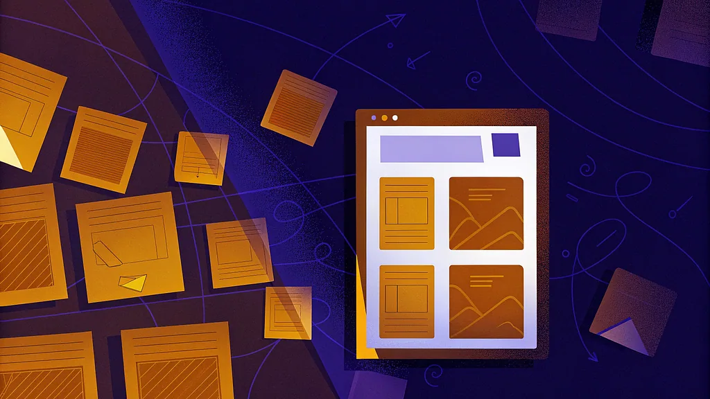
Most of the time, you design with incomplete information. You are building an MVP, a POC, or a first version based on decisions coming from many places. Business needs. Development constraints. Timing. Budget. Sometimes marketing. Sometimes just urgency.
You test ideas with the client, with the team, with people around you. That helps, but it is never the same as putting something in front of a real user. When that happens, things start to show.
Not always because the design is wrong. Sometimes because the system behind it is bigger than what anyone explained at the beginning.
When feedback hits production
I have been in situations where feedback came back as “the experience is not working”, and the first reaction is panic 😬. You start questioning the flow, the screens, every decision. Then you look closer and realize the issue is not purely design. It is missing functionality. Rushed development. Edge cases that were never covered. Or lack of QA that ended up breaking the experience.
That is a hard moment 😓. You have to explain that the problem is not that the idea was bad, but that the product is still growing, still unfinished. And yes, that is uncomfortable. But it is also normal.
Time, versions, and reality
Time plays a huge role here ⏳. Time is money, and products are built in versions. Very few things come out “right” the first time. Almost everything that feels smooth today went through many changes, fixes, and small corrections over time.
As we say in 🇺🇾 Uruguay, “no hay mal que por bien no venga”. It means that even when something goes wrong, there is usually something valuable that comes out of it.
In product work, the moments that feel like setbacks often end up revealing what really matters. A broken flow shows what users truly need. A rushed release exposes weak points. A bad first decision creates clarity for the next one. Those moments hurt, but they usually move the product in a better direction once you pay attention.
Products as systems, not screens
One thing that changed for me is understanding that products are not just screens. They are systems with history, people, habits, and limits.
There is always something that came before. Old ways of working, previous tools, manual steps, workarounds people rely on without even thinking about them. When you ignore that, the design might look good, but it feels foreign once it is used.
Once you see products this way, you stop expecting perfection early on. You stop trying to close everything in a single version. You start designing with movement in mind, knowing that things will shift, break, and need adjustment as the product finds its place in real use.
Pretty vs workable
There is also a constant tension between making things look good and making things work 🎨 -> ⚙️. Sometimes you have to let go of a design that looks great but does not fit the technical reality or the way users actually behave. That is not failing. That is adapting.
Redefining what good design means
I used to think good design was about arriving at the best solution 🤔. Now I think it is more about choosing a direction that can survive change. Simple enough to move. Clear enough to grow. Strong enough to hold when reality pushes back.
You will make decisions without having all the answers. Some of them will be wrong. Some of them will be right for the moment but wrong later 🙃. That happens a lot, especially early on.
What matters is how fast you react, how openly you adjust, and how much space you leave for the product to evolve. Designing for reality means accepting that the first version is rarely the final one, and that is ok.
This is the part of product design that does not show up in mockups. But it is the part that makes things last.