 Alejandro Gonzalez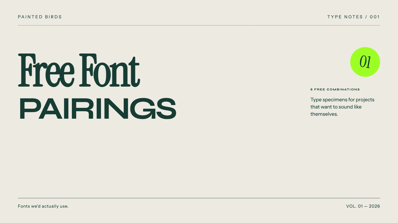
8 free font combinations we’d actually use
There are thousands of free fonts out there.
The problem is that somehow we keep seeing the same ones everywhere.
So for this first volume we picked 8 combinations that feel a bit different, are completely free and, most importantly, are fonts we would actually consider using in a real project.
No Montserrat + Merriweather.
Let’s go.
01. Instrument Serif × Instrument Sans
Contemporary / Editorial / Clean
Quiet spaces.
Lasting ideas.
An independent journal of architecture, objects and the people who give them meaning.
PAINTED BIRDS 01 / 08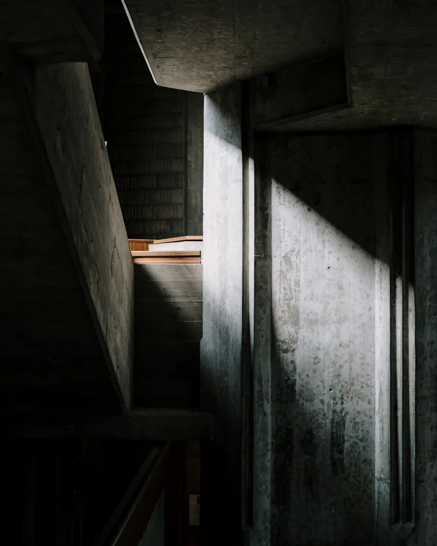
This is probably the safest pairing on the list, but not in a boring way.
Instrument Serif has a lot of personality, especially in big headlines, while Instrument Sans keeps the rest of the design clean and easy to read.
They were developed as companion typefaces, so they naturally work really well together.
We’d use it for:
Creative studios, architecture, fashion, restaurants and editorial websites.
Try it like this:
- Headlines: Instrument Serif Regular
- Body: Instrument Sans Regular
- Labels: Instrument Sans Medium / Uppercase
Feels like:
A modern magazine that happens to be a website.
Get Instrument Serif ↗ · Get Instrument Sans ↗
02. Bodoni Moda × Manrope
Elegant / Sharp / Modern
Less, but
exquisite.
Considered essentials. Beautiful materials. A collection made to stay with you.
PAINTED BIRDS 02 / 08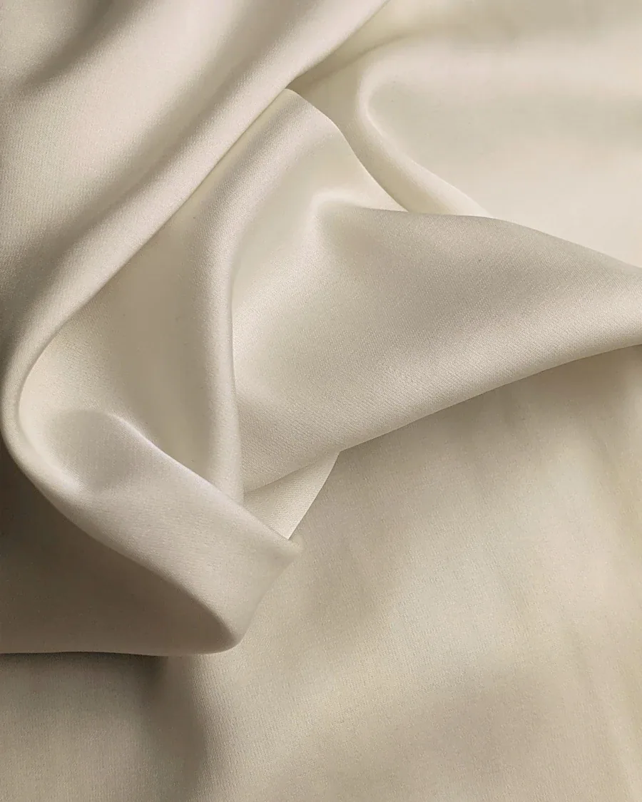
Bodoni is beautiful, but it’s also really easy to make it feel old or way too luxurious.
Manrope fixes that.
You still get the contrast and elegance from Bodoni Moda, but Manrope makes the whole thing feel much more current.
We’d use it for:
Fashion, beauty, hospitality, jewelry and premium ecommerce.
Try it like this:
- Headlines: Bodoni Moda 500
- Body: Manrope 400
- Navigation: Manrope 600
Feels like:
Something expensive without needing an expensive font.
Get Bodoni Moda ↗ · Get Manrope ↗
03. Syne × DM Sans
Creative / Graphic / Cultural
MAKE
SOME
NOISE.
Independent sounds. Unexpected encounters. A space for the next wave of culture.
PAINTED BIRDS 03 / 08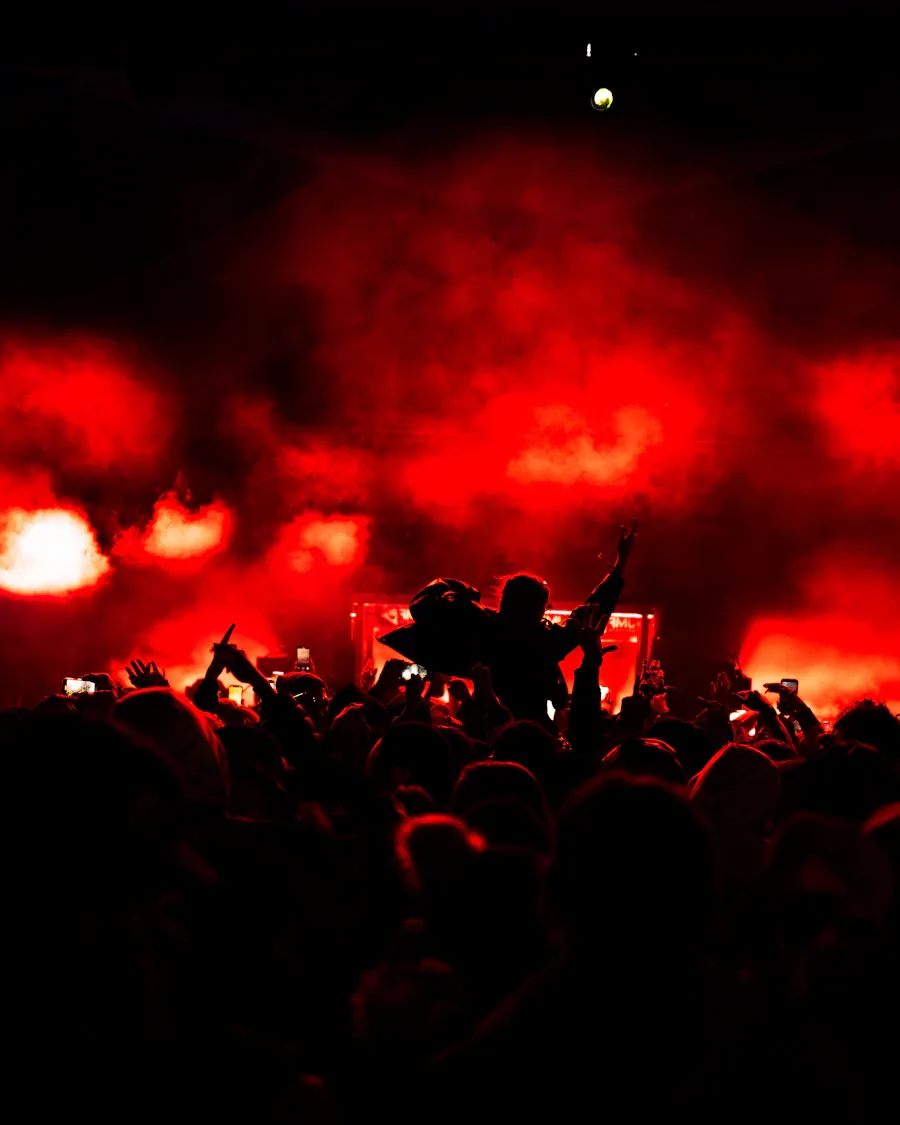
Syne already does a lot by itself.
It has weird proportions, strong shapes and enough personality to make a basic headline feel designed.
Because of that, pairing it with another expressive font would probably be too much.
DM Sans stays out of the way and lets Syne do its thing.
We’d use it for:
Music, fashion, events, studios and cultural projects.
Try it like this:
- Headlines: Syne 700
- Body: DM Sans 400
- Small text: DM Sans 500
Feels like:
A poster, but still usable as a real website.
04. Fraunces × Geist
Playful / Digital / Editorial
A little
sunshine.
Good things take their time. Freshly picked citrus, delivered with a little joy.
PAINTED BIRDS 04 / 08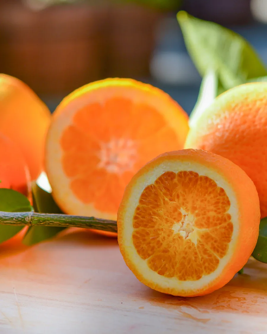
One of our favorites.
Fraunces is weird in a really good way. It can feel soft, retro, elegant or almost cartoonish depending on how you use it.
Geist is basically the opposite.
It’s simple, clean and made for interfaces.
That contrast is what makes the pairing work.
We’d use it for:
Food & beverage, lifestyle brands, startups, ecommerce and hospitality.
Try it like this:
- Headlines: Fraunces 600
- Body: Geist 400
- UI / Labels: Geist 500
Feels like:
A serious product with a bit more personality.
05. Unbounded × Literata
Experimental / Tech / Magazine
BEYOND
THE FEED.
Dispatches from the edges of the internet. New perspectives on a world that never stands still.
PAINTED BIRDS 05 / 08
This one is a bit more risky.
Unbounded is wide, futuristic and very hard to ignore.
Literata is calm, readable and made for long-form text.
They don’t look like they should belong together, which is probably why we like them.
We’d use it for:
Experimental products, magazines, music, tech and unconventional ecommerce.
Try it like this:
- Headlines: Unbounded 500
- Body: Literata 400
- Captions: Unbounded 400
Feels like:
Internet culture mixed with an independent magazine.
Get Unbounded ↗ · Get Literata ↗
06. Bricolage Grotesque × Source Serif 4
Quirky / Friendly / Sophisticated
Stay for
another.
Coffee worth slowing down for. Something warm from the oven. Your usual table, waiting.
PAINTED BIRDS 06 / 08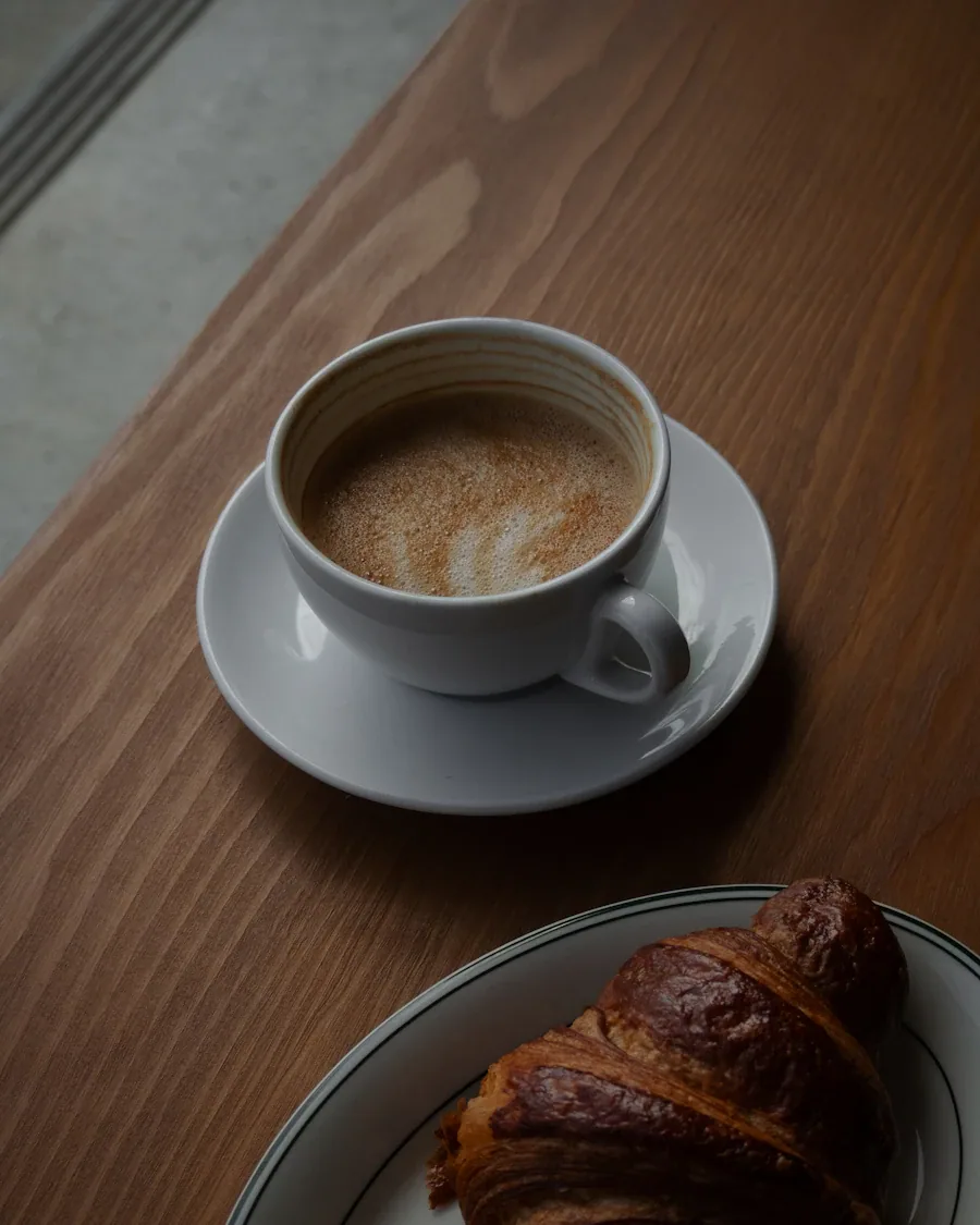
Bricolage Grotesque has enough personality to become a big part of a brand identity.
It’s different, but not so different that you get tired of looking at it after five minutes.
Source Serif 4 gives it some balance and works really well for longer text.
We’d use it for:
Food brands, cafés, stores, agencies and packaging-heavy brands.
Try it like this:
- Headlines: Bricolage Grotesque 600
- Body: Source Serif 4 Regular
- Navigation: Bricolage Grotesque 500
Feels like:
A little weird, but still polished.
Get Bricolage Grotesque ↗ · Get Source Serif 4 ↗
07. Archivo Black × Newsreader
Bold / Brutalist / Editorial
TAKE UP
SPACE.
A different view of the city. Stories about the places we share and the people who shape them.
PAINTED BIRDS 07 / 08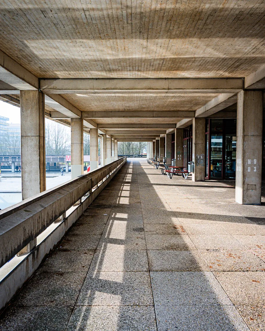
Archivo Black is not subtle.
And that’s exactly why we’d use it.
Instead of trying to soften it with another sans serif, Newsreader creates a much stronger contrast.
Big heavy headline. Calm serif body.
Simple.
We’d use it for:
Editorial projects, restaurants, streetwear, posters and cultural brands.
Try it like this:
- Headlines: Archivo Black
- Body: Newsreader 400
- Italic text: Newsreader Italic
Feels like:
A poster turned into a website.
Get Archivo Black ↗ · Get Newsreader ↗
08. Space Grotesk × Cormorant
Tech / Fashion / Refined
A softer
future.
Where thoughtful technology meets the tactile world. Digital experiences with a human touch.
PAINTED BIRDS 08 / 08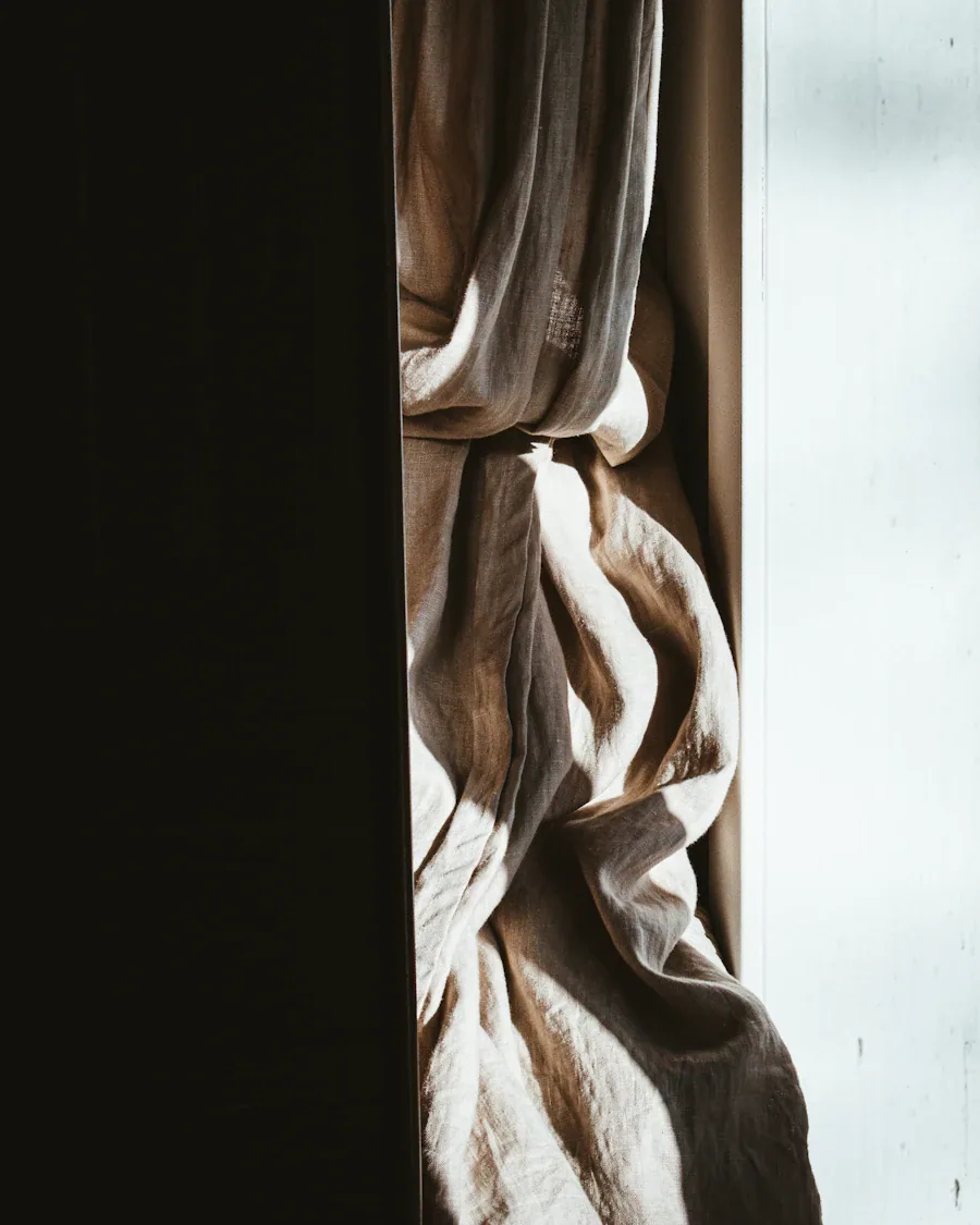
Space Grotesk is everywhere for a reason.
It works.
But pairing it with another sans usually makes everything feel very startup.
Cormorant pushes it somewhere completely different.
It brings in a more editorial and fashion-driven feeling without making the whole thing hard to use.
We’d use it for:
Fashion-tech, architecture, portfolios and premium digital products.
Try it like this:
- Headlines: Cormorant 500
- Body: Space Grotesk 400
- UI: Space Grotesk 500
Feels like:
Tech, but not startup tech.
Get Space Grotesk ↗ · Get Cormorant ↗
The pairing is only half of it
Two good fonts don’t automatically make a good design.
Size, spacing, weight, hierarchy and how much you actually use each one matter just as much.
Sometimes one font should do 90% of the work and the other one only needs to appear in a couple of big moments.
That’s usually more interesting than forcing both of them everywhere.
All the fonts in this list are free and open source. You can find them on Google Fonts, with their licenses included in each download.
We’ll keep looking for more.
Painted Birds
Free Font Pairings Vol. 01