Productivity software
Tropos
- Product strategy
- Information architecture
- UX/UI
- Role
- Industry
- Year
- Product strategy, IA, UX/UI
- Productivity software
- 2026
Project overview01
What if a workspace actually followed the way work moves?
Our own studio had a familiar problem: the work was moving, but the record of it was split between notes, wiki pages, chat, calendars, transcripts and shared credentials. Each tool solved one piece. Together, they made the team reconstruct context before making progress.
Tropos is what we built. Product strategy, information architecture and UX/UI all came out of one thesis: a project should be the centre of gravity, and every page, message, meeting and file should know where it belongs.
The challenge02
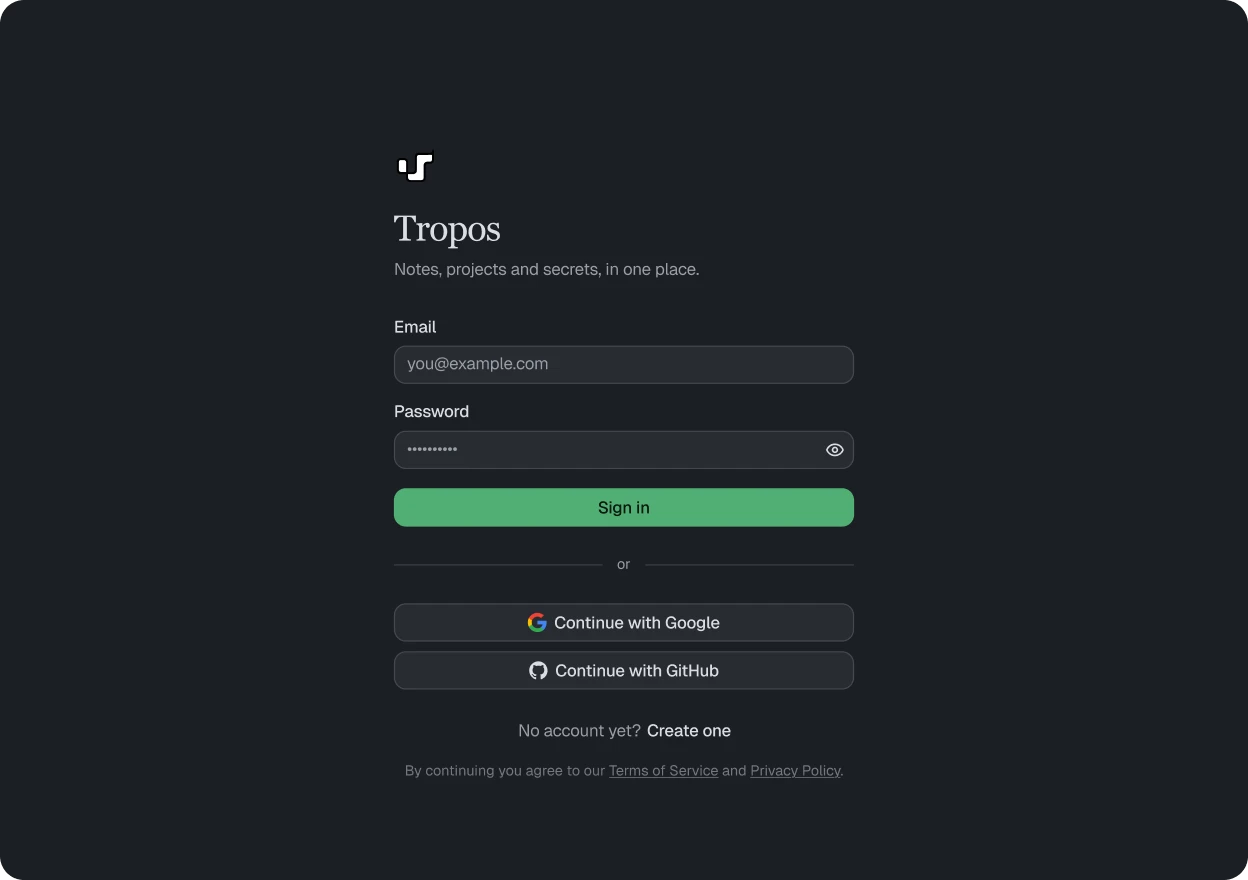
Replacing six tools is easy. The hard part is not losing the reasons people picked them. Tropos had to be faster than the old stack for everyday writing, clearer for seeing where a project stands, and solid enough that a studio would trust it with everything it knows.
At a glance03
Every tool solved one piece. None of them talked.
What was scattered
Nobody could remember where anything was. The brief in one tool, the decision in a chat, the meeting nowhere at all, and plan limits quietly deciding what the team could keep.
How it fits together
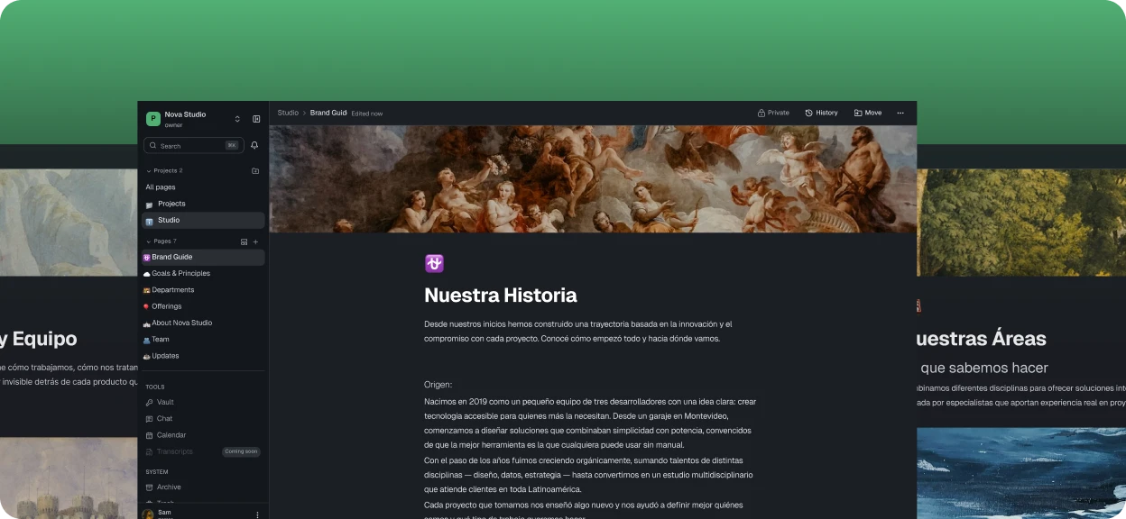
One project model for pages, chats, calendar events, transcripts and vault items, so moving between them keeps the context instead of starting another search.
How it feels to use
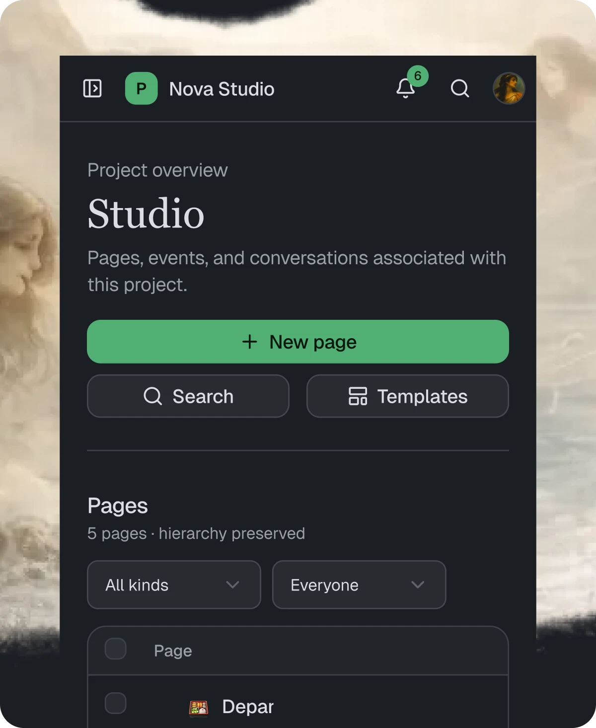
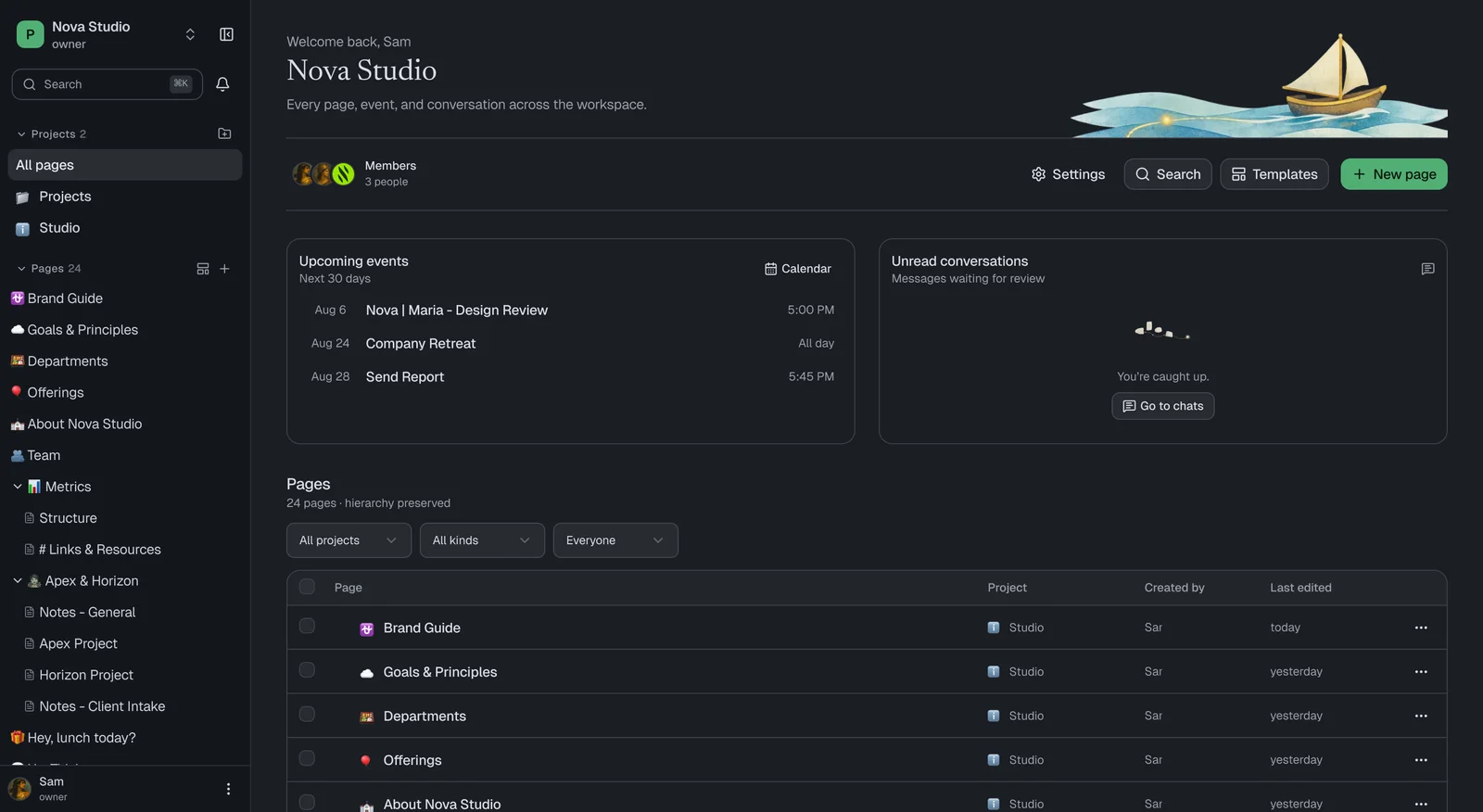
It opens on where things stand: pages, what is coming up, what is unread, and how the projects sit together. The same patterns carry down to the phone.
How we got there04
Choose the shared object before drawing screens
We considered organising the workspace around tools, teams or projects. A tool-first structure repeated the fragmentation; a team-first structure lost client context. We chose the project as the shared object, then derived the information model and the screens from it.
What they were using
- Tool audit
- Talking to the team
- Where context goes missing
What a project is
- The project model
- What belongs where
- Getting your data back out
Drawing it
- The workspace
- Editor and pages
- Moving between things
Making it real
- Web app
- Chat and calendar
- Desktop shell
Living in it
- Studio rollout
- Client spaces
Scope of work05
What the work covered
Audit the real workflow, not the tool list
We mapped what people actually did in each product: write decisions, find the latest brief, check meetings, ask questions, store access. Features that existed only because a tool offered them stayed out.
Make the project the primary object
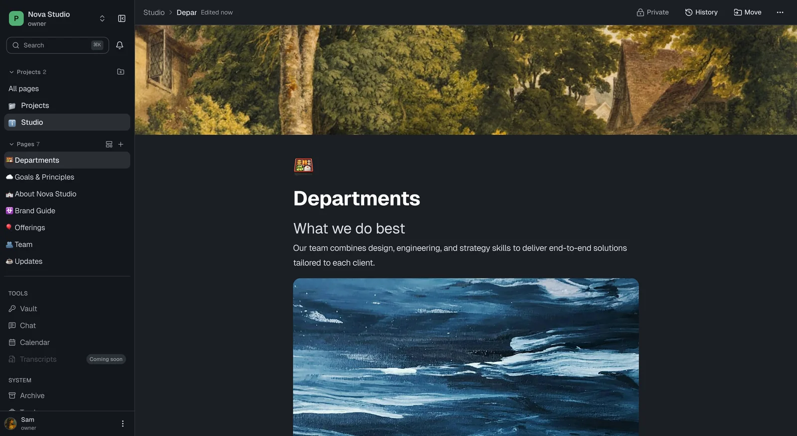
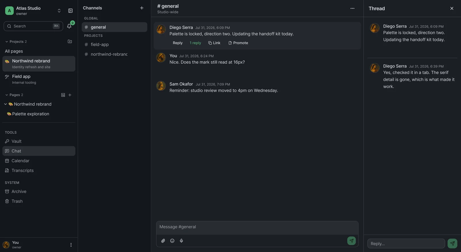
Pages, chat, calendar, transcripts and vault entries all hang from the same project structure, so a user can move between record, discussion and next step without rebuilding context.
Turn meetings into product memory
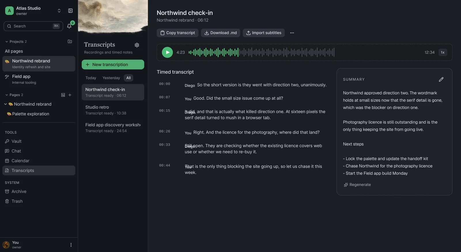
AI transcription writes back into the project it belongs to, with summaries and next steps treated as documentation rather than as a loose export to file later.
Design against lock-in
The system keeps a local Markdown copy alongside cloud sync and runs in a Tauri desktop shell, so the studio can leave the cloud without losing its history.
User archetypes06
Three roles, one record
A studio is not one kind of user. The same workspace has to answer to someone accountable for the week, someone producing the work, and someone building it. The tension between them was speed versus legibility.
Studio lead
- Role
- Runs the studio and answers for client work.
- Motivations
- Needs to know which projects moved, which meetings matter and what still needs a decision.
- Behaviour
- Starts in the overview and the calendar. Reads far more than they write.
- Pain points
- Loses time when chat, calendar and docs each tell a different version of the week.
Designer
- Role
- Produces and documents the work, day to day.
- Motivations
- Wants a fast place to write, paste screenshots and tie a decision back to what prompted it.
- Behaviour
- Writes in Markdown, links pages to conversations and switches client context all day.
- Pain points
- Breaks focus when a note, a thread and a transcript have to be reassembled after the fact.
Engineer
- Role
- Builds what the studio designs.
- Motivations
- Wants the current spec, not a version of it, and the reason behind the decision that made it.
- Behaviour
- Arrives from a link, reads one page deep, and leaves. Rarely browses.
- Pain points
- Builds the wrong thing when the handoff lives in a message that has scrolled away.
Product thesis07
The design decision was not to place six tools behind one sidebar. The hard part was deciding what the shared object should be: a page-centered project record that conversations, events, transcripts and vault items can all point back to.
Operational outcomes08
What changed in the studio
The useful measure was not a vanity adoption curve. It was whether the studio could stop maintaining six tools and still recover the state of a project quickly.
- 6 tools replaced by one workspace
- Notes, wiki, chat, calendar, transcripts and passwords moved into one workspace.
- Context recovery
- Pages, events, unread conversations, ownership, hierarchy and recency are visible from the workspace overview.
- Meeting memory
- Transcripts and summaries attach to the project they came from.
- Plan ceiling removed
- No core capability requires upgrading a third-party seat plan.
- Exit cost
- Local Markdown and the desktop shell keep the studio from depending on one cloud.
Example use case (Monday morning)
A designer opens a client workspace and reads the week in one screen: two events, four unread messages and the page that changed on Friday. The kickoff call at eleven records itself; by noon, the transcript and summary sit under the same project as the brief.
Design system09
Colour and type
- Deep pineHex: 0C1210
- ForestHex: 1F3A2C
- Signal greenHex: 3F8A5C
- MintHex: EDFFF4
- PaperHex: FFFFFF
Interface
Geist
Everything the product is operated with: navigation, writing surfaces, tables, menus, metadata and chat.
Editorial
Newsreader
Held back for atmosphere: empty states, onboarding and presentation covers. It never touches product chrome.
Outcome
- Tropos now holds the studio's day-to-day project memory: pages, decisions, meetings, chat and access in one workspace.
- Six separate subscriptions collapsed into one owned system without feature gates shaping how the team works.
- The product and brand were designed together, so the workspace feels like part of the studio rather than another rented admin layer.